Brand Design
Role: Solo Designer
Nov - Dec 2025
Rooted is a final brand design project for my Graphic Design class. The fictional company is a grunge and gritty tea company. Rooted has one ingredient: raw tea leaves. That’s it. No junk. No additives. No lies. They're here to provide real tea that tastes good and fuels your body, not poison it.
Name: Rooted
Tagline: Raw and Real
Mission: To provide tea lovers or caffeine addicts with real and pure loose leaf options,
healthier and
without microplastics or additives.
Target Market: Avid tea drinkers, providing them with a healthier alternative.
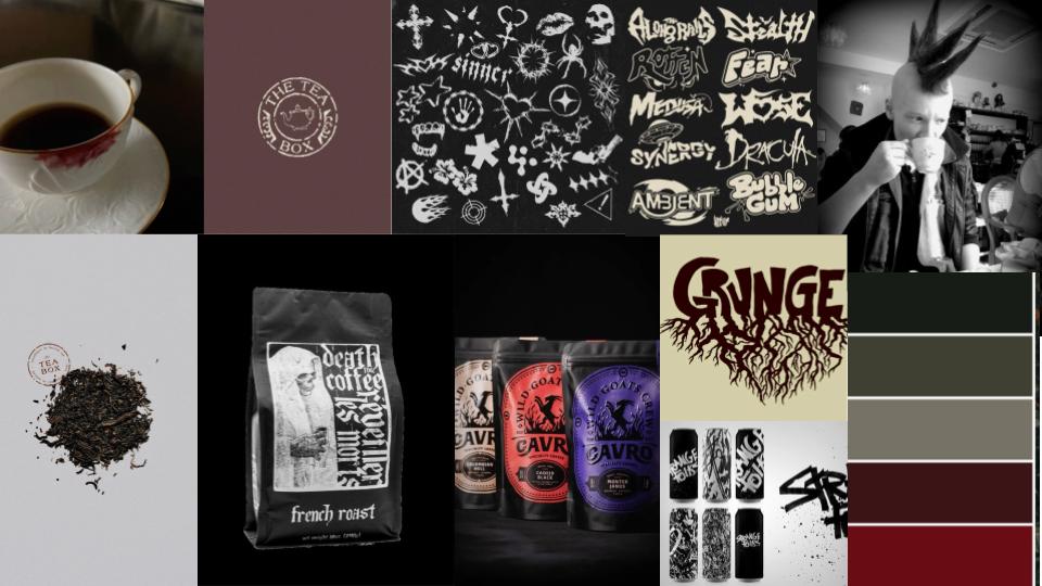
Brand Attitude: Grunge, Honest, Gritty/Rough, Earthy
Brand Values: Authenticity, Health, The Earth, Community, Balance
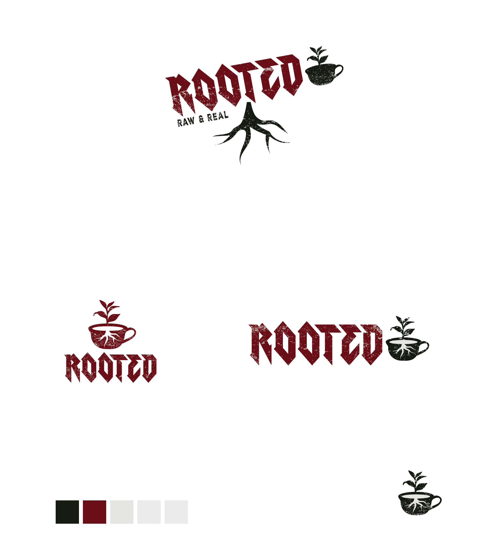
The logo is inspired by roots and nature, with a rough and hand-drawn aesthetic to reflect the brand's
gritty and authentic attitude. The typography is bold and organic, emphasizing the brand's commitment to
real and raw ingredients.
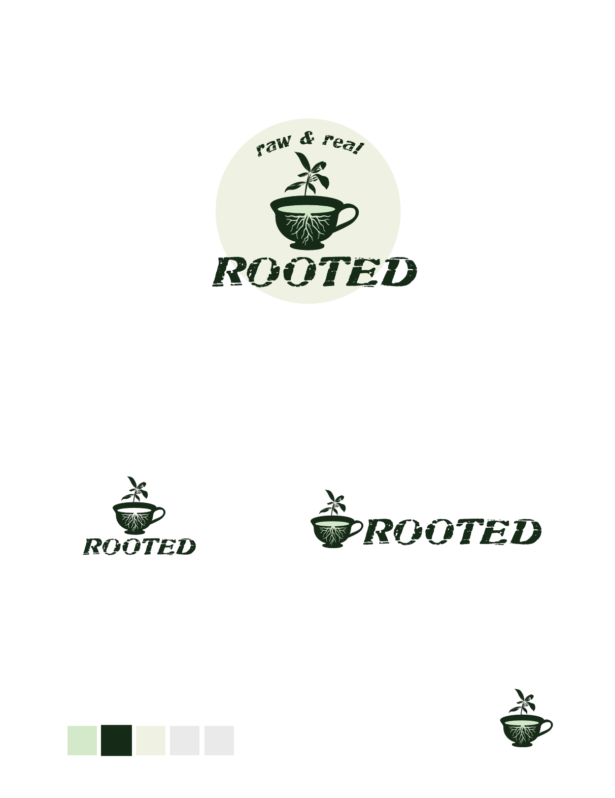
We started by drafting 25 logo concepts on paper (logo matrix).
Then, took those ideas onto Adobe Illustrator going through three rounds of logo designs, with professor
and peer feedback on each. A total of 6 logos drafted on Illustrator.
Below are my concepts from
round
1, and the final logo I ended up with!
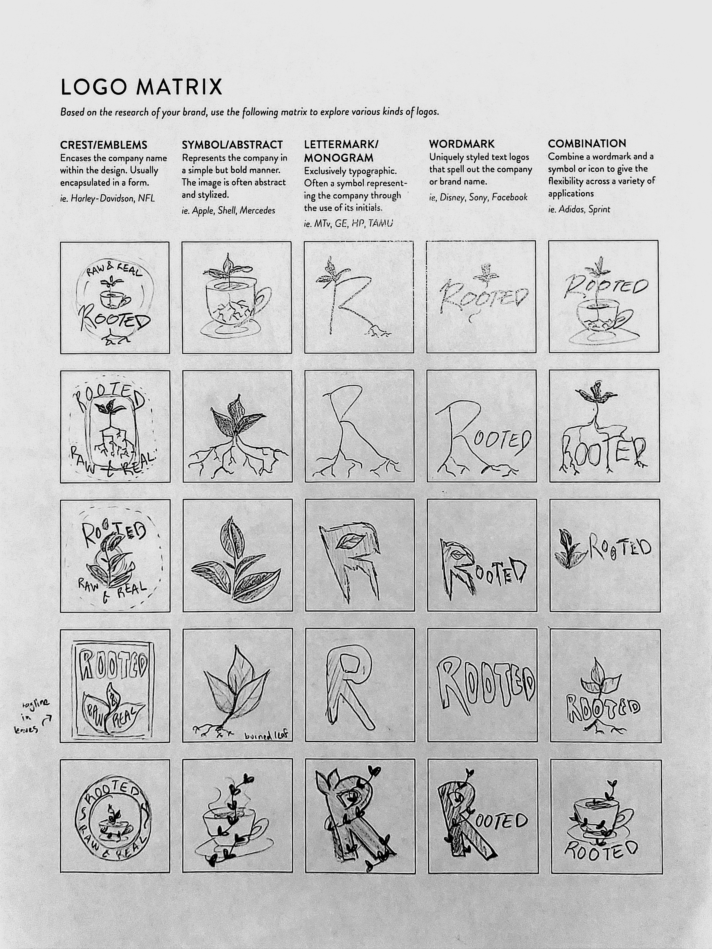
Logos round 1
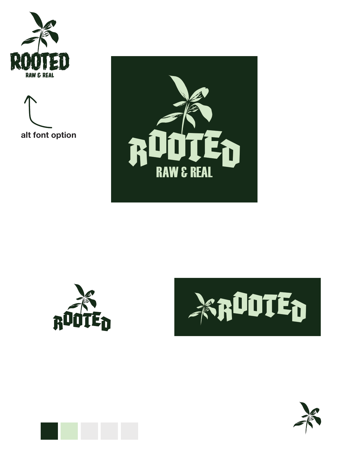
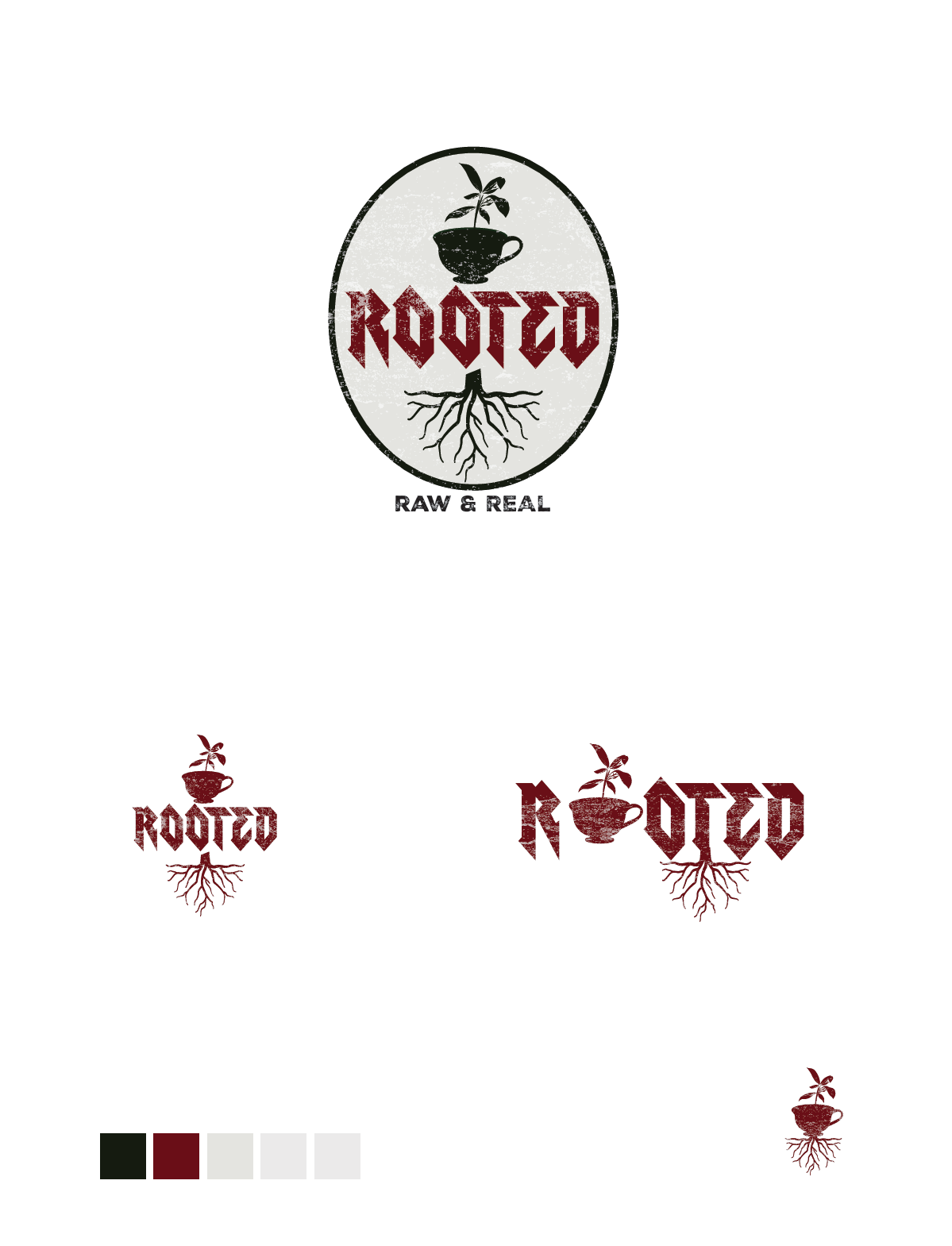
Final Logo
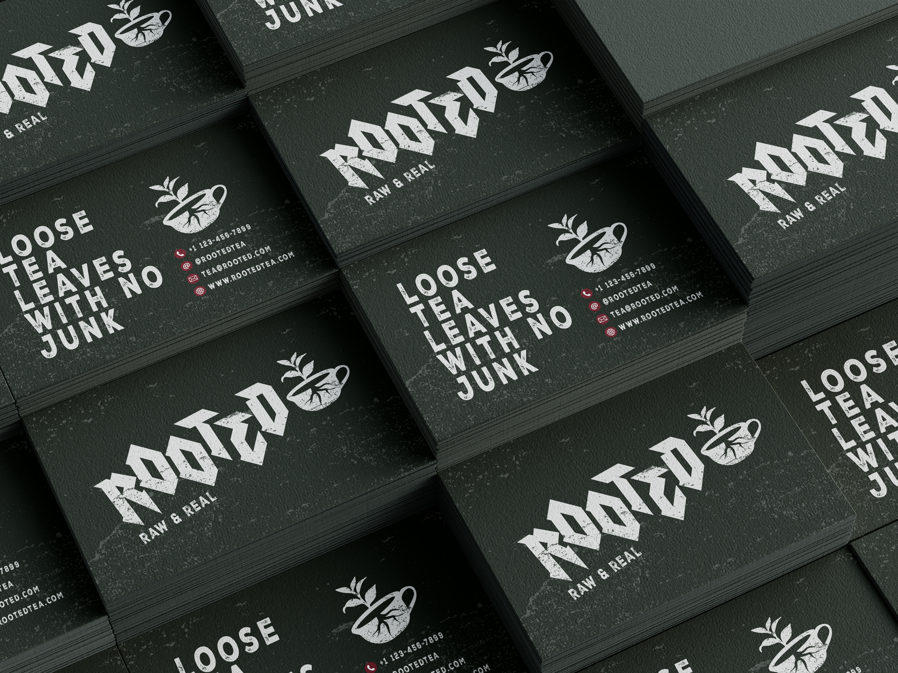
The business cards are dark, and feature the adapted logo on the front, with a textured overlay to reflect the earthy and natural vibe of the brand. The back includes contact information in a clean and simple layout.
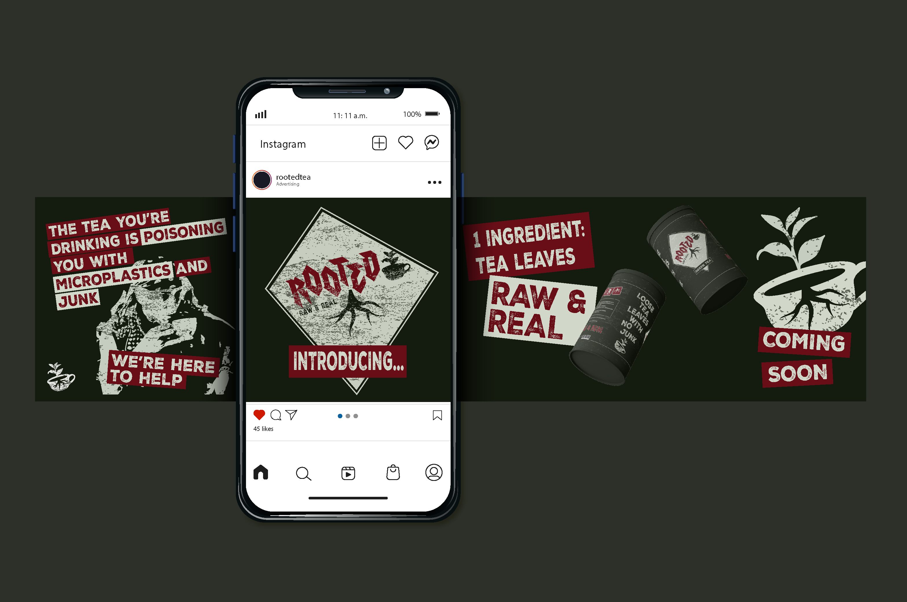
The instagram ad was designed to capture attention with its bold typography, punk aesthetics and language to match the brand, and promote the brand's commitment to real and raw ingredients.
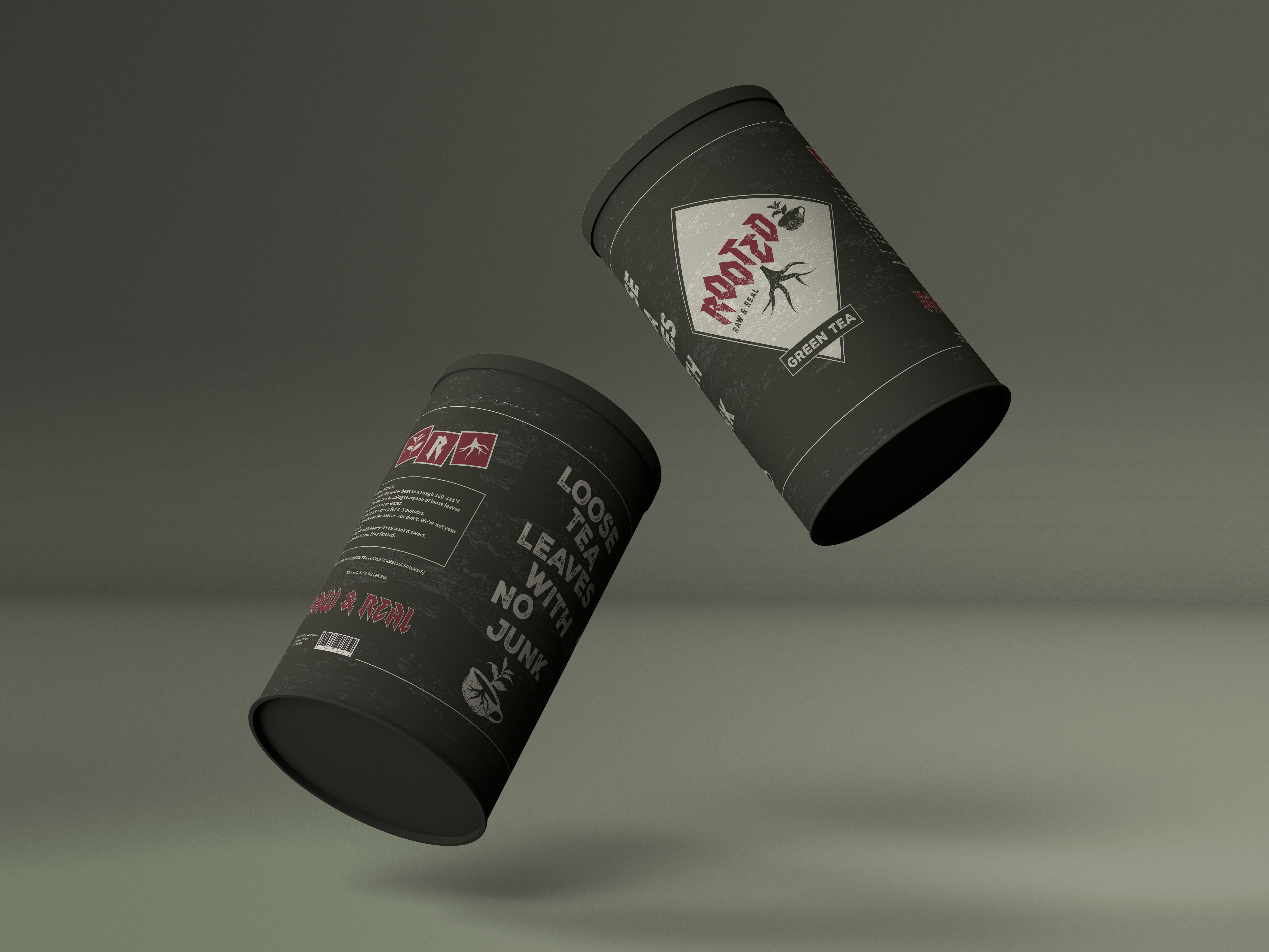
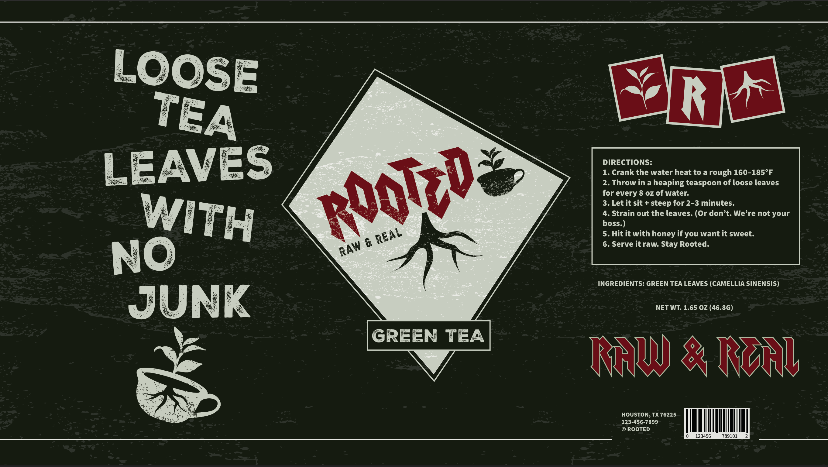
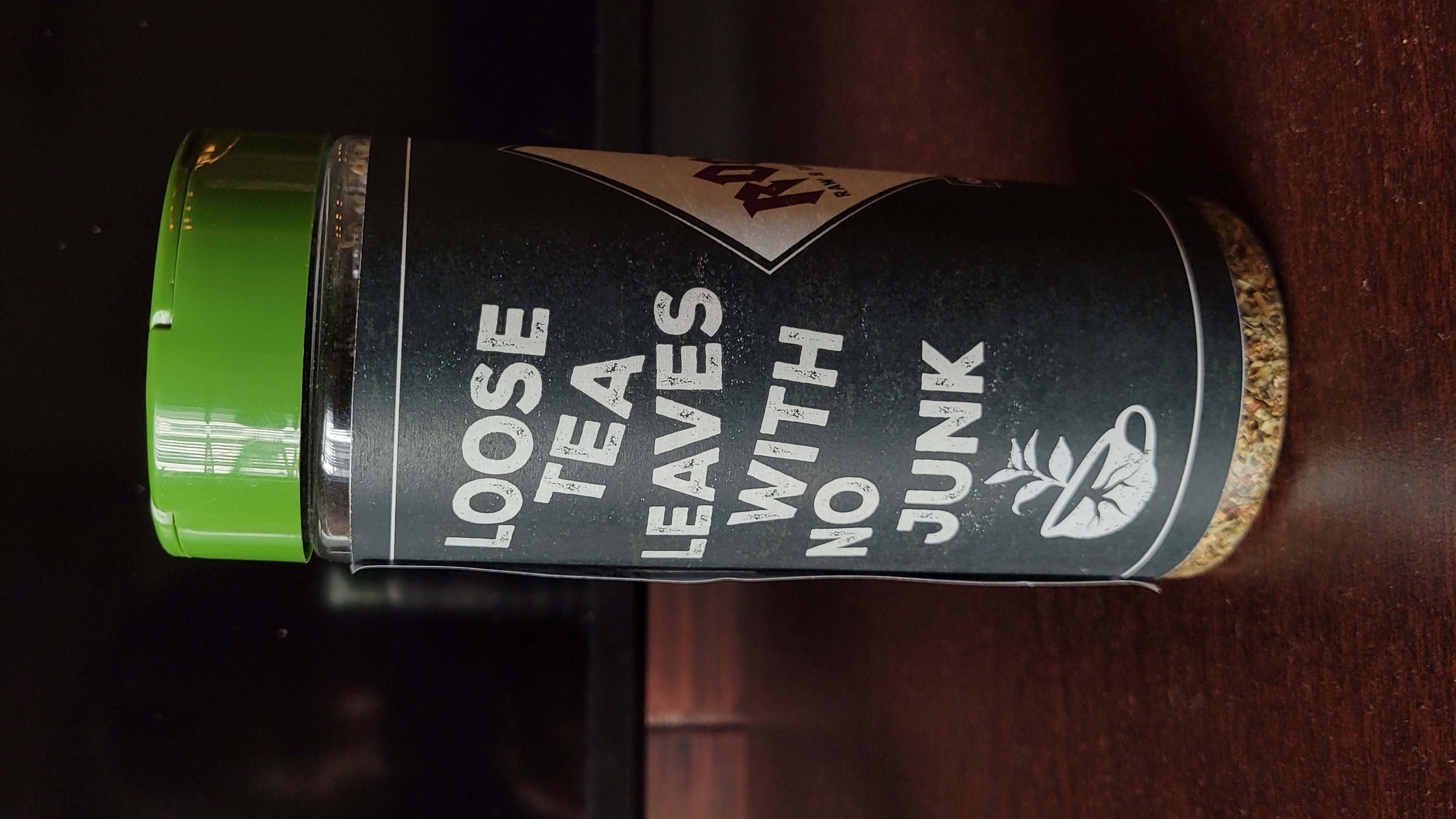
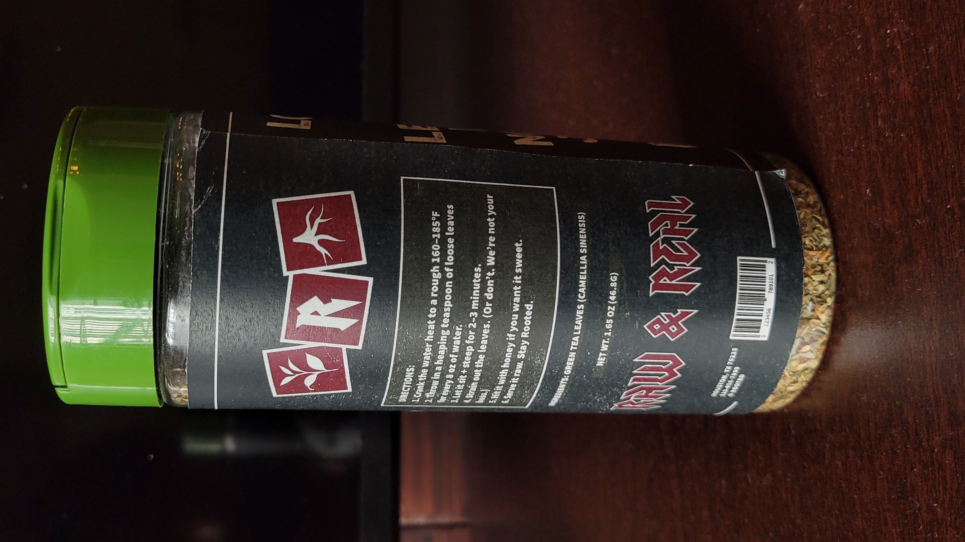
FOr the product packaging, I wanted it o reflect the grunge and gritty language of the brand, bring
that in the emblem styled logo and rough overlay to catch a customers eye in the store, and use that
punk language in tagline and directions.
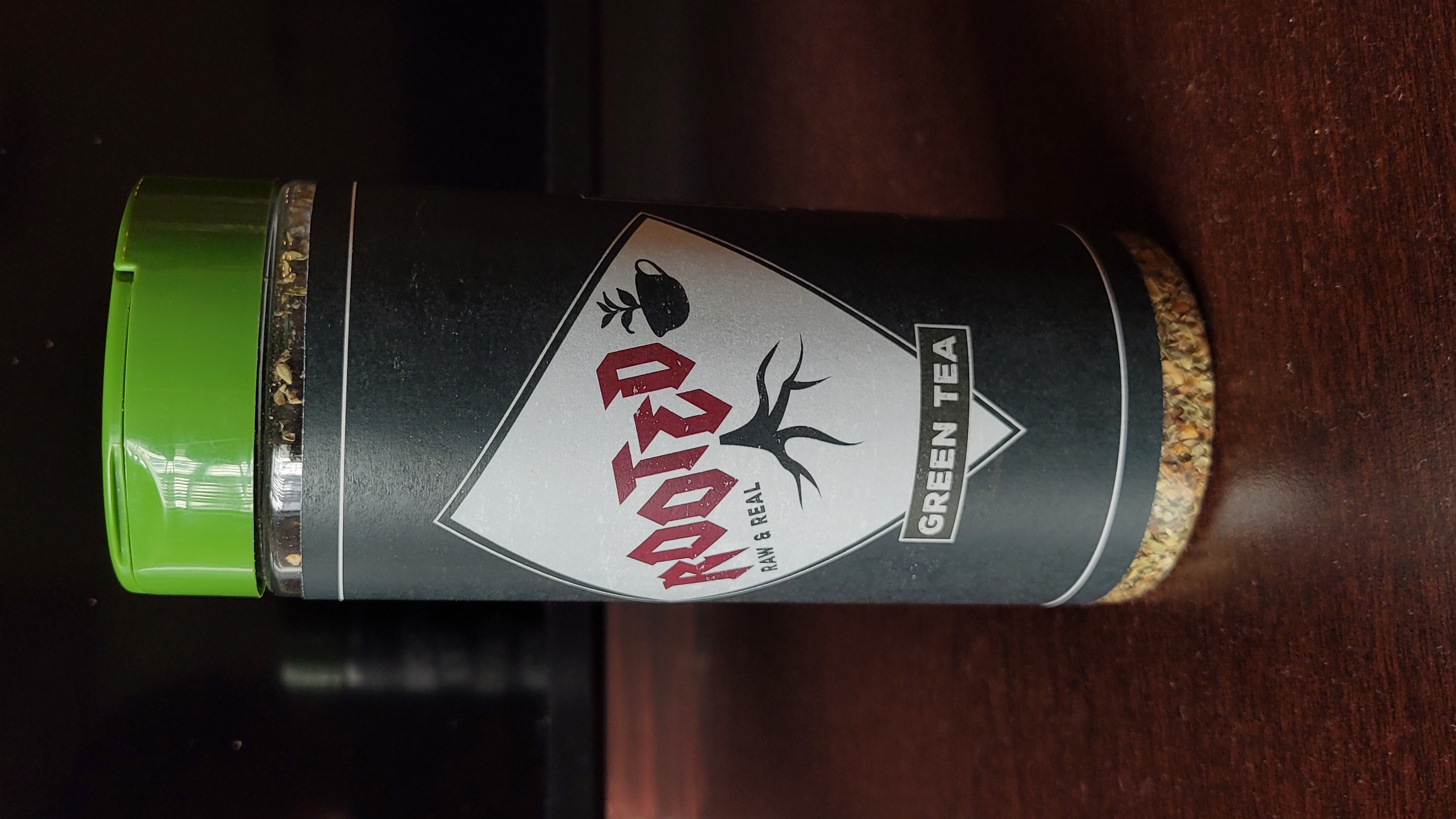
My first iteration of the packahing was different, a little too minimalistic, but I recieved
feedback from mt professor to lean into the loud and grunge aesthetic, make the elements larger,
rougher, and so that's exactly what I did and I love it so much more.
Finally, I created a brand guidelines booklet to showcase Rooted's mission visual identity, including logo usage, color palette, typography, and imagery style.
This project was so much fun to work on, and I really enjoyed being able to create a brand from
scratch. I
learned a lot about the design process, and how to take feedback and iterate on my designs. I also
learned
a lot about branding, and how to create a cohesive visual identity for a company.
It was
especially
challenging to go in the loud and punk direction, learning to overcome my fear of taking risks in
designs and not falling into the minimalistic trap.
Overall, I'm
really proud of
the work I did on this project, and truly believe that I've grown as a designer.
Project for the ARTS 303 Class at Texas A&M University
Professor: Jill Honeycutt